Brand
Guidelines
About Us
Talroo is helping organizations like Uber, McDonald’s, UPS, The Home Depot, Target and more, find and hire their essential workforces. Our data-driven job and hiring event recruiting platform turns the entire Internet into a help wanted sign. Our pay-for-performance model enables customers to maximize efficiency, not waste spend, and hire employees faster than they could with any of our competitors.
Rather than drive customers to a destination site, Talroo uses a consumer marketing approach to deliver job opportunities to candidates where they are already spending time online. Similar to what Google AdSense and Facebook Ad Networks do for their advertisers, Talroo uncovers the right candidates that companies are looking to hire.
Talroo leverages a search-and-match algorithm powered by state-of-the-art AI technologies. Our deep-learning processes analyze billions of signals daily, assessing the job seeker-employer relationship in real time. This produces significantly better search results for the job seekers, and higher quality applicant matches for the employer.
Finding the right people is difficult, but with Talroo, it doesn't have to be.
What We Do
Our data-driven job advertising platform reaches the candidates you need to build your essential workforce. We use AI to find unique talent audiences and only charge you for the performance we deliver. With audiences you won’t find anywhere else, plus expert client service throughout your campaign, Talroo helps you save time, spend wisely and hire better.
Tag Lines
- The fastest way to hire your essential workforce.
- Hiring your essential workforce doesn't have to be difficult. Talroo can help.
- Stop Searching. Start Hiring.
- Finding and hiring the right people is hard. Talroo, the fastest way to find/hire/build your essential workforce.
Brand Promise
Talroo is revolutionizing how companies hire. We deliver essential worker applicants to Fortune 500 companies through our job advertising platform. Powered by our cutting-edge technology and our extensive internet reach, we find workers where no one else can. We want to impact the future of work every day and help match candidates with employers.
Brand Personality
Approachable, engaging, dynamic, customer-focused, trustworthy.
Mission
Matching businesses with the candidates they need, wherever they are.
Vision
Connecting businesses with the best essential worker candidates in the nation.
Brand Tone
Genuine, uplifting, skillful, authentic.
Tone and Voice
“The way a brand looks is just as important as the way it sounds.”
Brand Personality:
Confident, dependable, motivated, creative and personable.
Social Media Tone:
Friendly yet informative, energetic and trustworthy.
When Talroo posts on social media, we want to be confident and empathetic. We might ask questions that show we are interested in customer concerns. We might be more casual and playful. Remember to always remain professional.
Email Tone:
When Talroo communicates over email, we want to be authoritative, but compassionate.
Our Voice Sounds:
Daring, uplifting and inspirational.
Company Core Values
At Talroo, we live by a set of principles and beliefs known as our Core Values. These values serve as our foundational guide and daily reminder of what drives us. It’s in our DNA.
Each Core Value is denoted with unique iconography that represents the intent behind each value. Several initial color variations are offered, however additional variants may be created in the future to fit use cases for Talroo’s other brand color schemes.
Act with Integrity
Success starts with always doing the right thing. We all win when we lead with integrity in our interactions with our customers, as well as each other.
Passion to Win
We are a high-performance company which competes fiercely to win. We’re intrinsically driven, passionate and we strive for excellence in all aspects of our company.
Make an Impact
It’s ok to swing and miss within the boundaries of our values. We strengthen our company and culture every day by exiting comfort zones, showing courage and never settling.
Teamwork
We're all stronger when we work together. Whether it's collaborating with other departments, or taking responsibility for our individual roles, we grow when we put the whole team first.
Customer First
Our customers are our lifeblood, and our success as a business depends on listening attentively and providing them with phenomenal experiences.
Colors
Color usage
The colors in the logo should stay consistent at all times, however, some situations call for adjustments.
*The logo mark should never be any color other than our approved gradients, white, black or the default scheme.
Purple Heart + Han PurpleSecondary Colors
Grayscale
When it is known that items will be printed in grayscale or black and white (invoices, stationary, letterheads, etc.) the correct logo should be used to achieve highest contrast possible for the logo to be legible and clear.
0%
10%
20%
30%
40%
50%
60%
70%
80%
90%
100%
Logo
Download Logo KitThe Talroo Masterbrand is comprised of two elements, the logo symbol and logo type. The logo symbol is a powerful image that represents our customer’s ability to control their level of demand.
The logo type has been carefully chosen for its modern, refined, highly versatile and legible style. It has been further enhanced by the use of uppercase letters. The typeface is a combination of Montserrat Regular and Montserrat Bold which has been chosen to compliment and balance the text with the logo symbol.
Logo meaning
The logomark symbolizes our effort to create alliances and partnerships with companies and individuals who have the same goal of connecting people with opportunity.
Masterbrand
The primary lockup (masterbrand) is horizontal in orientation and should be used whenever possible. However, if a format does not allow for this, a vertical alternate may be used. The logomark should only be used on its own in situations where the name is adjacent in some form (such as an app icon).
Alignment
The center of the logomark should align to the center of the logotype.
The spacing between the logomark and the logotype is the width of the letter “l” in the logotype.
This clear space is based on half of the height of the master brand.
Clear Space
A minimum area of space must always surround the logomark / logotype / master brand lockups. Allow 25% of the size of the logomark for spacing surrounding the mark. This area of isolation allows the identity to stand out by ensuring that other visual elements are kept clear from the mark.
Alternate Lockup
In cases where limited availability prevents usage of the primary horizontal logo lockup, an alternate lockup may be approved. Usage of a vertical logo lockup should conform to the spacing guidelines below.
Alignment
In the alternate vertical lockup the logomark is separated from the logotype by width of the “l” in lattice.
*Please note this relationship and lockup is critical for balance, as the letter-forms have been customized.
This clear space is based on 25% of the height and width of the master brand.
Clear Space
A minimum area of space must always surround the logomark / logotype / master brand lockups. Allow 25% of the size of the logomark for spacing surrounding the mark. This area of isolation allows the identity to stand out by ensuring that other visual elements are kept clear from the mark.
Logomark
In certain cases, the Talroo brand name may be present within a an existing space or element. In such cases, usage of a separate logomark may be approved. Examples includes social and other profile icons, favicons, etc.
Alignment
The center of the logomark should align to the center of the logotype.
The spacing between the logomark and the logotype is the width of the letter “l” in the logotype.
Clear Space
A minimum area of space must always surround the logomark / logotype / master brand lockups. Allow 25% of the size of the logomark for spacing surrounding the mark. This area of isolation allows the identity to stand out by ensuring that other visual elements are kept clear from the mark.
Typography
Get Roboto FontFont
Talroo’s primary font for digital usage utilizes the open source Roboto family of fonts. It is a sans serif font that is both simple and optimized for digital media.
When performance constraints require usage of a system font stack, sans serif should be used. This includes usage for fallback fonts. Usage of sans serif for a fallback will help reduce rendering jank.
Roboto Regular
a b c d e f g h i j k l m n o p q r s t u v w x y z
A B C D E F G H I J K L M N O P Q R S T U V W X Y Z
1 2 3 4 5 6 7 8 9 0 ! @ # $ % ^ & * ( ) _ + < > ? { } | \
Roboto Medium
a b c d e f g h i j k l m n o p q r s t u v w x y z
A B C D E F G H I J K L M N O P Q R S T U V W X Y Z
1 2 3 4 5 6 7 8 9 0 ! @ # $ % ^ & * ( ) _ + < > ? { } | \
Roboto Black
a b c d e f g h i j k l m n o p q r s t u v w x y z
A B C D E F G H I J K L M N O P Q R S T U V W X Y Z
1 2 3 4 5 6 7 8 9 0 ! @ # $ % ^ & * ( ) _ + < > ? { } | \
Roboto has a dual nature. It has a mechanical skeleton and the forms are largely geometric. At the same time, the font features friendly and open curves. While some grotesks distort their letterforms to force a rigid rhythm, Roboto does’t compromise, allowing letters to be settled into their natural width. This makes for a more natural reading rhythm more commonly found in humanist and serif types.
This is the regular family, which can be used alongside the Roboto Condensed family and the Roboto Slab family.
Source: Google
Headlines
Headline tag usage should follow logical order according to HTML5 specifications. Use heading tags to maintain semantic HTML structure. To modify or enhance design, use utility classes and other styling methods instead of changing HTML tags and breaking logical heading order.
H1 Connecting people with opportunity.
H2 Connecting people with opportunity.
H3 Connecting people with opportunity.
H4 Connecting people with opportunity.
H5 Connecting people with opportunity.
Headings communicate the organization of the content on the page. Web browsers, plug-ins, and assistive technologies can use them to provide in-page navigation.
Source: W3C Heading Guidelines
Iconography
Download Icon KitTalroo’s iconography is designed to create a simple and identifiable representation of major industries. Iconography has been carefully chosen for its simplicity and ease of use across various media forms. It has been further enhanced by the use of unique color schemes.
Industry Verticals
These guidelines describe the visual elements that represent Talroo’s industries. This includes unique iconography to represent each industry. For industry-specific color schemes, refer to the "color usage" section above.
Financial Services
Find banking, insurance, and tax prep professionals despite seasonal fluctuations.
Logistics & Transportation
Find the licensed and qualified drivers you need in this competitive industry.
Restaurant & Food Service
Reach a new candidate source to fill your high-turnover positions.
Gig Economy
From ride sharing drivers to freelance professionals, find on-demand workers you need.
Manufacturing
Get qualified candidates for hard-to-fill roles, even in difficult locations.
Grocery & Retail
When you’re hiring for volume, especially in your busiest season, Talroo can help.
Customer Service
In a high-turnover, high-volume industry, Talroo helps uncover new candidates.
Hospital & Healthcare
Reach healthcare pros at a competitive cost in this high-demand industry.
Fulfillment & Distribution
Make hires for fulfillment & distribution centers.
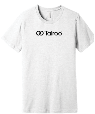
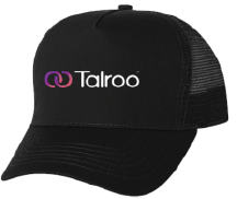
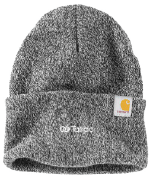
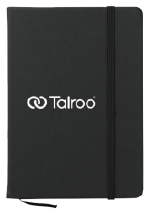
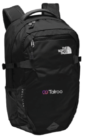
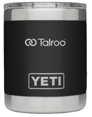
Swag Styles
Talroo’s swag guidelines are what help keep the Talroo brand consistent across all aspects. Using neutral colors, the Talroo logo and simple designs, the swag of Talroo is unique and clean.
There is a Talroo Employee Store where you can find all the swag available.
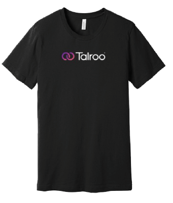
The Talroo logo needs to be centered or on the left chest pocket of shirts and jackets.
Allowed colors are black, grey, white and the logo has to be black, white or with the gradient.
All swag needs to be approved by creative@talroo.com.
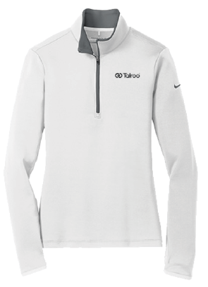
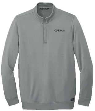
The Talroo logo needs to be centered on all other products, as shown to the left.
Allowed colors are black, grey, white and the logo has to be black, white or with the gradient.
All swag needs to be approved by creative@talroo.com.
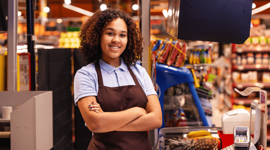
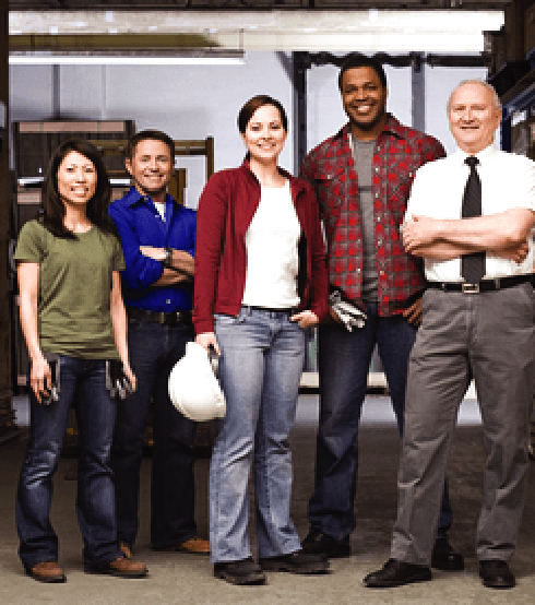
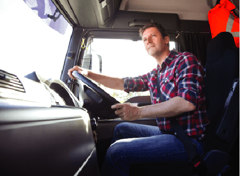
Photography
Imagery helps to illuminate our brand’s story. We strive for bright, positive and high-quality photos. Our main focus is on hard working essential workers.